
Here at DoltHub, we’re building a React library to share hooks, contexts, utilities, and components between our web applications. Storybook has been a useful tool for testing and reviewing UI changes before we publish our React components. This blog will walk you through how we set up Storybook to test the UI for our React components and create a better CI workflow.
Why Storybook?#
Storybook is a frontend workshop for building UI components and pages in isolation.
We’re building a React component library to consolidate components we use among our four web applications. Some of these components are identical between applications, and some have subtle differences.
We needed a way to test these components in isolation and easily recognize changes among different UI variants. Without Storybook, we would need to copy over a component to the library, update it with any necessary variants, and then spin up a local server for each of our web applications and test the component in each environment. This was prone to error, as testing certain states of some components could be difficult and time intensive.
Storybook captures UI variations as “stories”, where we can supply different props and mock data to simulate all states in different environments before we test the component within our applications.
In combination with Chromatic, we can write UI tests and diff UI changes to better catch UI regressions in CI, which we have relied on error-prone unit tests for in the past.
It also helps us better collaborate with our web designer. He can view our components in one place, as well as test user interactions and change props from the Storybook UI.
Setting up Storybook#
Our React library is a monorepo of general-use
React components, hooks, contexts, and utilities. We want to set up Storybook specifically
for our components package.
First, we install Storybook in our
components package.
components % npx storybook@latest initThis command may ask a few questions about your desired bundler and framework. Then it installs the required dependencies, sets up scripts to run and build Storybook, and adds default configuration and some boilerplate stories.
We should now be able to start Storybook and go through their tutorial.
components % yarn storybook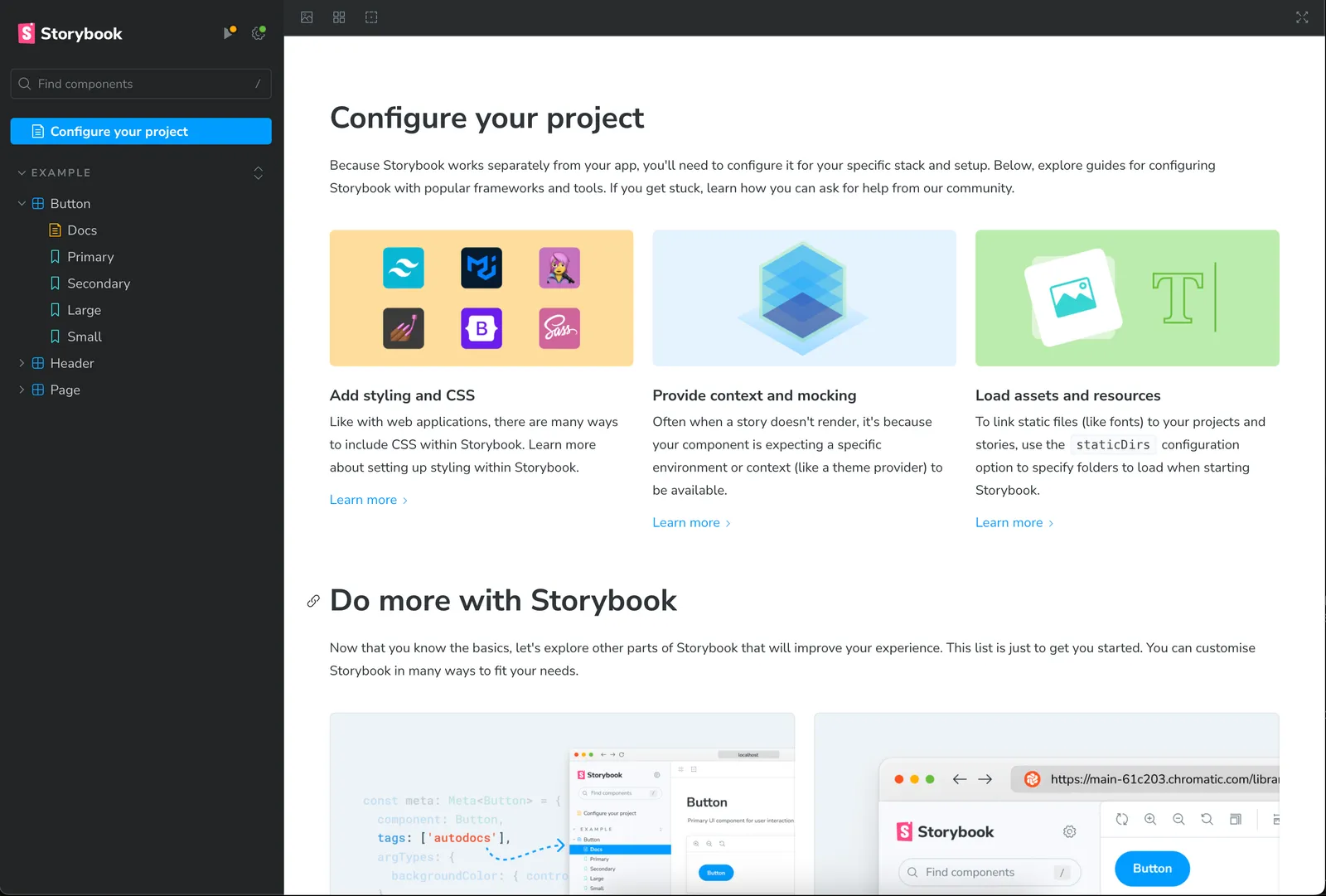
Depending on your setup this may be enough to get you started and you can skip to the Writing a story section. However, if you use CSS modules and TailwindCSS to style your components like we do, you may require some additional configuration.
Additional configuration for CSS modules and Tailwind#
To use CSS modules and Tailwind with Storybook, we first need to install two additional
packages,
@storybook/addon-styling-webpack
and postcss-loader.
components % yarn install @storybook/addon-styling-webpack postcss-loaderThen we add webpack configuration to .storybook/main.ts that loads the PostCSS plugins
needed for Tailwind.
const config: StorybookConfig = {
  // additional config
  webpackFinal: async config => {
    (config.module?.rules ?? []).push({
      test: /\.css$/,
      use: [
        {
          loader: "postcss-loader",
          options: {
            postcssOptions: {
              plugins: {
                "tailwindcss/nesting": {},
                tailwindcss: {},
                "postcss-preset-env": {},
                cssnano: {},
                autoprefixer: {},
              },
            },
          },
        },
      ],
      include: resolve(__dirname, "../"),
    });
    return config;
  },
};
Now when we write our first story below, our Tailwind classes should work correctly.
We took one additional step to make our CSS module class names more readable in Storybook.
Storybook CSS module class names default to a hash (i.e. kypUKhWmF7muntdUGk3g), whereas
we use a more readable class name pattern when we build our components using Rollup:
[folder]_[local]__[hash:base64:5]. The default Storybook class name hash makes it more
difficult to debug components in Storybook by inspecting the elements using browser dev
tools.
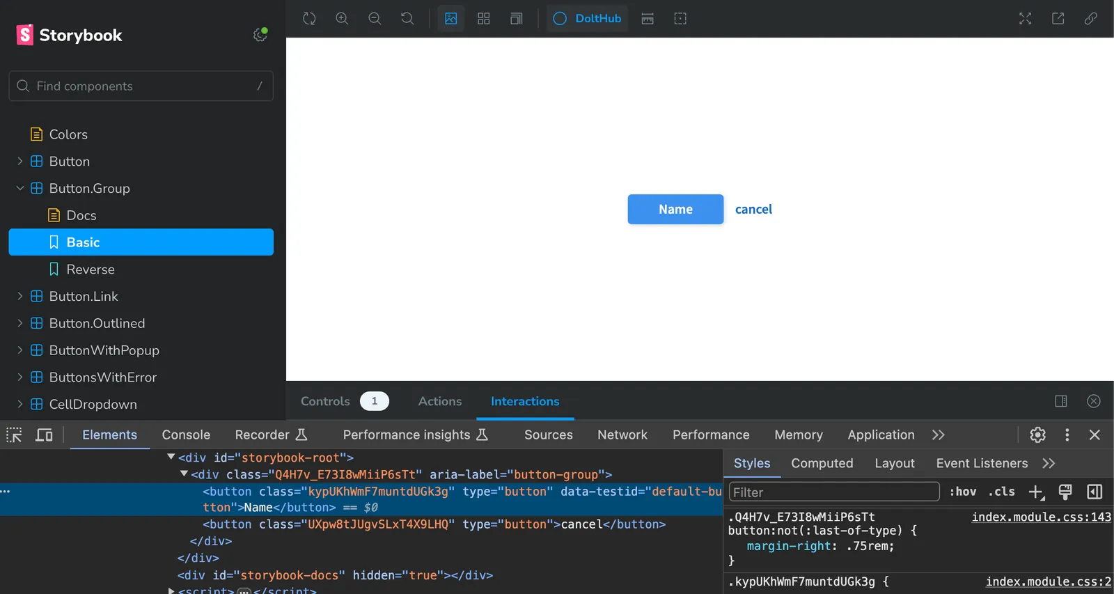
We can match our Rollup class name pattern by installing the
storybook-css-modules addon and
adding the following configuration to our .storybook/main.ts file.
const config: StorybookConfig = {
  // other config,
  addons: [
    // other addons
    {
      name: getAbsolutePath("storybook-css-modules"),
      options: {
        cssModulesLoaderOptions: {
          importLoaders: 1,
          modules: {
            localIdentName: "[folder]_[local]__[hash:base64:5]",
          },
        },
      },
    },
  ],
};
Now if we inspect a component we see our readable class names.
You can see our full Storybook configuration on GitHub.
Writing a story#
Now that Storybook is configured and ready to go, we can add our first
story, which captures the
rendered state of a UI component. We’ll start with a simplified version of our Button
component,
which looks something like this.
// components/src/Button/index.tsx
import cx from "classnames";
import React, { ButtonHTMLAttributes } from "react";
import css from "./index.module.css";

type VariantProps = {
  red?: boolean;
  green?: boolean;
  small?: boolean;
};

type ButtonProps = ButtonHTMLAttributes<HTMLButtonElement>;
type Props = ButtonProps & VariantProps;

function Button({
  children,
  className,
  red = false,
  green = false,
  small = false,
  ...props
}: Props) {
  return (
    <button
      className={cx(
        css.button,
        {
          [css.red]: red,
          [css.green]: green,
          [css.small]: small,
        },
        className,
      )}
      type="button"
      {...props}
    >
      {children}
    </button>
  );
}

export default Button;
This is a pretty standard looking blue button, with variants to make the background color red or green and make the button smaller. We want to test our different variant props using Storybook.
We create a new story file in components/src/stories called Button.stories.tsx and add
our default Button.
// components/src/stories/Button.stories.tsx
import type { Meta, StoryObj } from "@storybook/react";
import Button from "../Button";
const meta: Meta<typeof Button> = {
title: "Button",
component: Button,
tags: ["autodocs"],
parameters: {
layout: "centered",
},
};
export default meta;
type Story = StoryObj<typeof Button>;
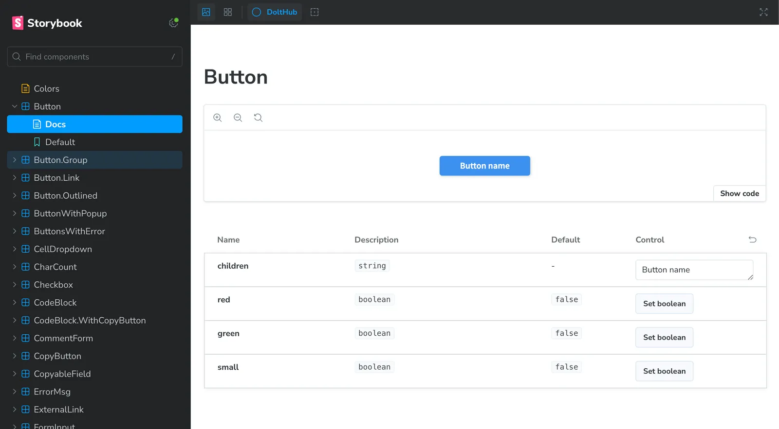
export const Default: Story = {
args: {
children: "Button name",
},
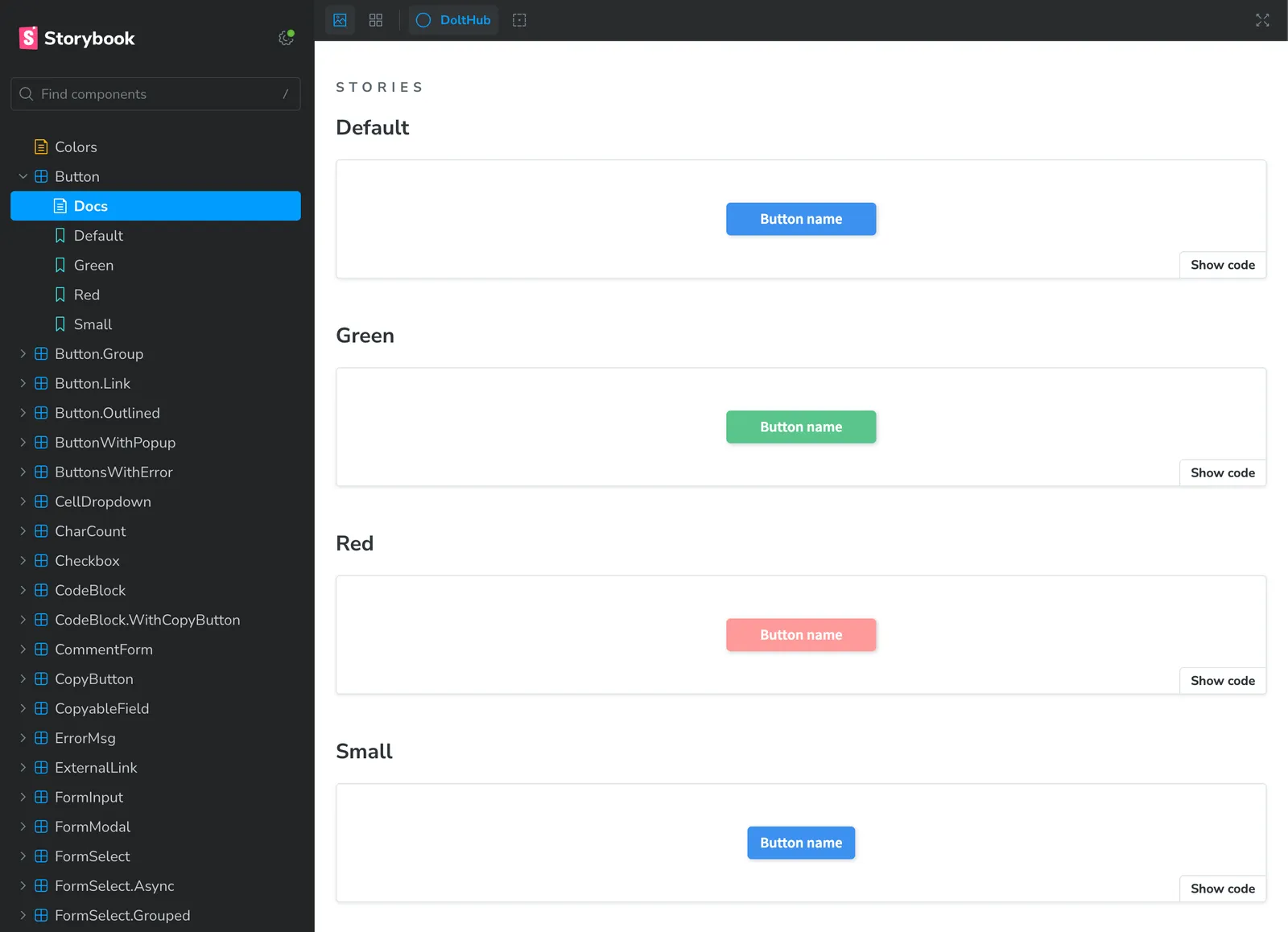
};When we run Storybook, we see our default Button and the auto-generated
documentation.
Looks good so far! Now we add additional stories for the different button variants.
export const Green: Story = {
  args: {
    ...Default.args,
    green: true,
  },
};

export const Red: Story = {
  args: {
    ...Default.args,
    red: true,
  },
};

export const Small: Story = {
  args: {
    ...Default.args,
    small: true,
  },
};
And we will see Storybook update with the button variants.
Now if we update any code related to our Button component, we will see the updated UI
automatically in Storybook.
Interactions#
We can add interactions to our stories to test scenarios that otherwise require user interaction. These are helpful for catching changes to user interactions in components.
First we install the necessary addons.
yarn add -D @storybook/test @storybook/addon-interactionsWe can use the play function in our Button story to a build a component interaction
that tests if the onClick prop is called when a user clicks the button.
import { expect, fn, userEvent, waitFor, within } from "@storybook/test";
// ...
export const Default: Story = {
args: {
children: "Button name",
onClick: fn(),
},
play: async ({ canvasElement, args }) => {
const canvas = within(canvasElement);
const button = canvas.getByRole("button");
await userEvent.click(button);
await waitFor(async () => expect(args.onClick).toHaveBeenCalled());
},
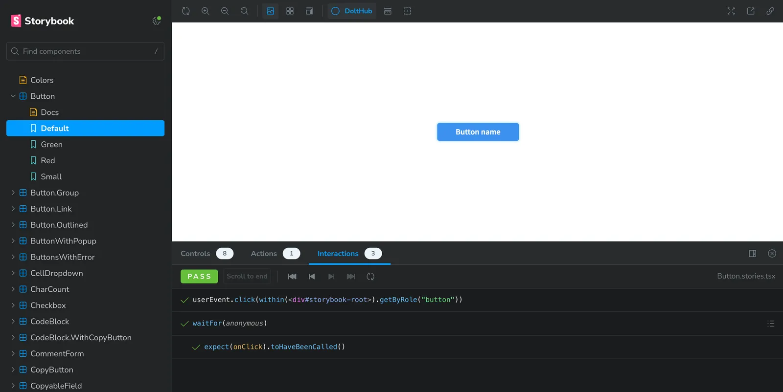
};When we start Storybook and navigate to our default Button story, we can see this
interaction run in the “Interactions” tab.
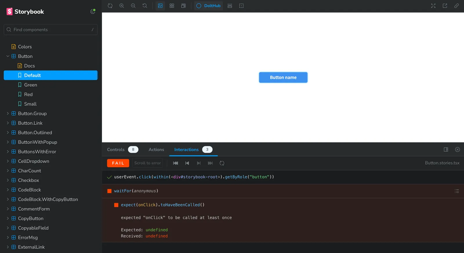
If we make a change to Button that prevents the user from successfully clicking, we’ll
see that failure.
Toggling themes#
The components in our React library are shared among a few different web applications, each with a different color theme. We utilize Tailwind themes to configure these different color themes.
Essentially the custom Tailwind color named button-1, used for the background color of
our Button component, has a different rgba values for each application.
We can create a theme toggle in our Storybook toolbar to view our components with different color themes applied.
If you want to know more about creating dynamic Tailwind themes or adding a theme toggle to your Storybook, check out this previous article
Using Chromatic in CI#
What we have so far is a great improvement to the developer experience for viewing UI additions or changes to React components. However, we also want to utilize Storybook for catching UI bugs in CI (continuous integration) and for UI reviews from other team members.
This is where Chromatic comes in. Chromatic is a visual testing and review tool that uses Storybook to scan every possible UI state across browsers to catch visual and functional bugs.
Our workflow#
Every component in our React component library must come with a story.
If a developer makes a change to a component, like changing the red variant color for a
Button for example, they can use Storybook to see how the change affects the component
UI.
When the developer is satisfied with their changes, they’ll open a pull request. CI runs on every pull request, and includes standard checks like unit tests, lint, and compiling and building successfully.
{
  "scripts": {
    "ci": "yarn prettier && yarn lint && yarn compile && yarn build && yarn test"
  }
}
If these tests pass, the changes are published to Chromatic. This adds two additional checks to our pull request: UI Testing and UI Review.
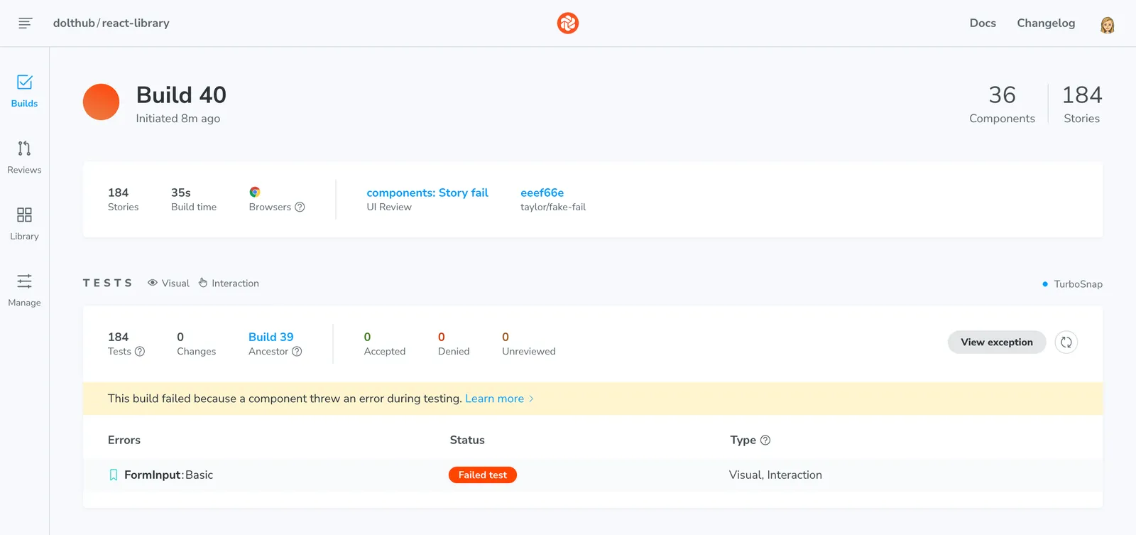
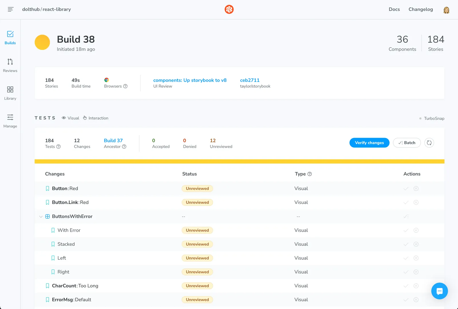
UI Tests pinpoint visual changes and verify user interactions. Whenever a developer pushes new code, Chromatic generates a new set of snapshots and compares them against the baseline. If there are test errors or unintended changes, they can verify the changes are intentional.
If any of our Storybook interactions fail, we’ll get a Chromatic build error. This can
happen if our play tests that we wrote above fail.
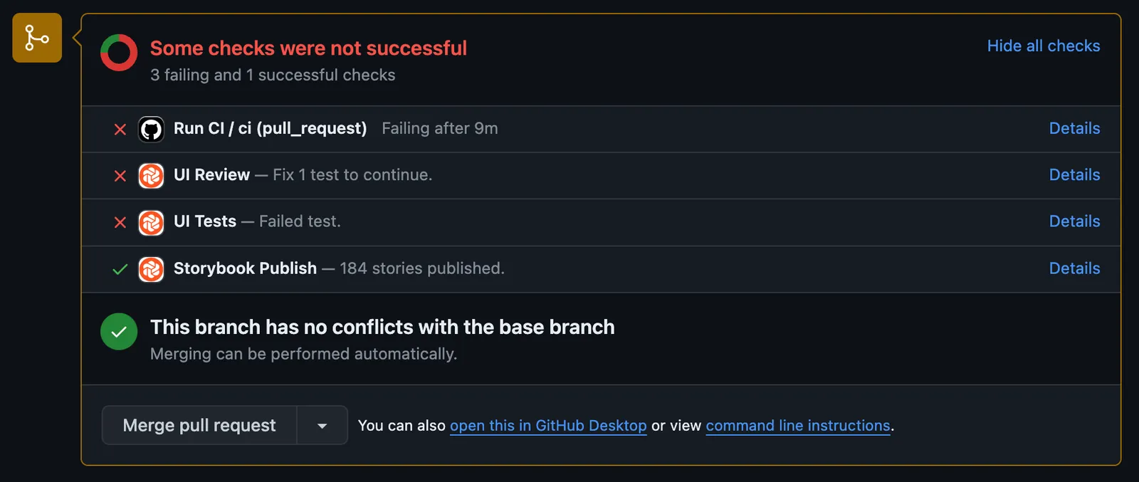
We can see what components were affected by the error and how by clicking on the UI Tests link in our PR.
The developer fixes the failing test and pushes again to the PR, triggering another Chromatic build.
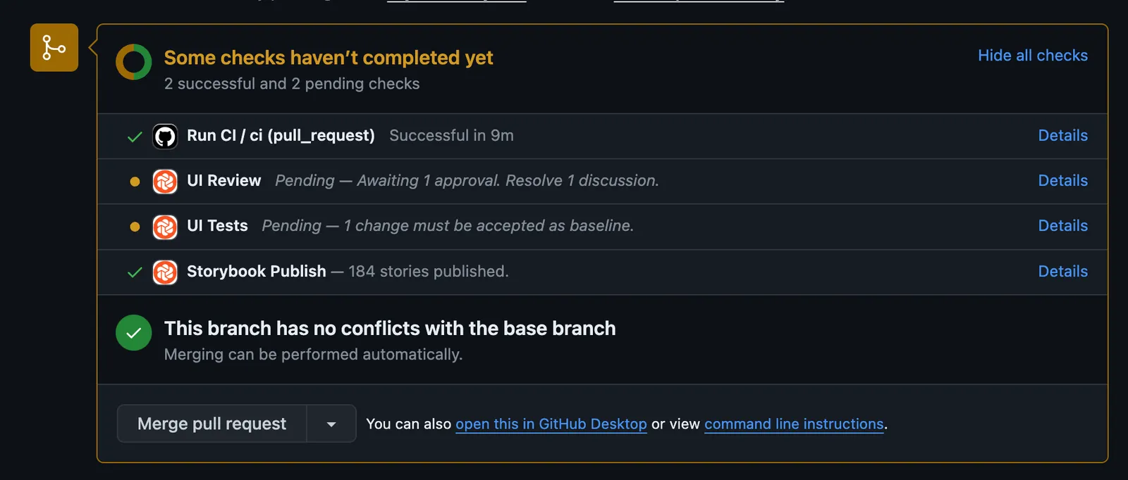
This build passes and they can review the UI build for any unintended changes.
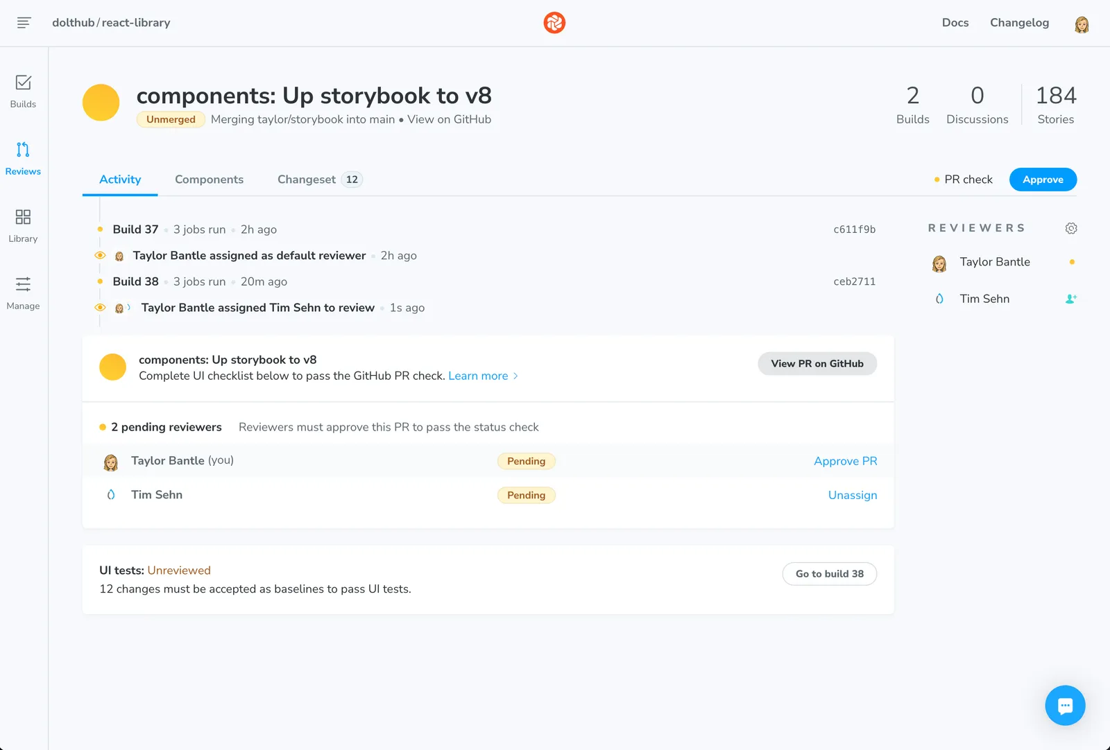
Once the developer has verified the changes, the UI Tests check on GitHub will pass and we can move to UI Review.
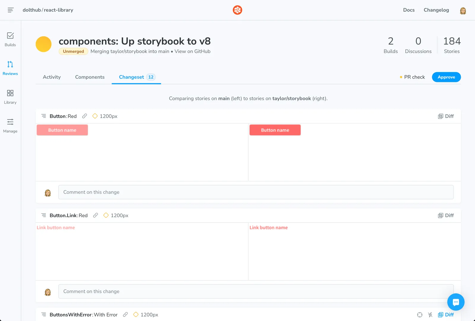
UI Review looks similar to a pull request on GitHub. We can tag teammates as reviewers and give direct feedback on components within this page.
However, instead of viewing diffs of code changes, you view diffs of UI changes. Changing the hex of our red Tailwind color class results in a diff of every component affected by the change.
Our designer and other decision makers can review and discuss the change until they are ready to give their stamp of approval.
Once all tagged reviewers approve, our GitHub pull request will pass all checks and we can
merge to main. Whenever we merge to main we make sure to build Chromatic on this
branch. This gives us a permalink that will always have the most up-to-date version of our
components.
You can see our Storybook permalink here.
Setting up Chromatic for CI using GitHub Actions#
We use GitHub Actions to run CI on all of our pull
requests. Our React library has two workflows: one for CI on pull
requests
and one for publishing Chromatic on merges to
main.
Since we’re using a monorepo, we only want to build Chromatic for CI on changes to our
components package. We use paths-filter to achieve this. This is what our CI
GitHub Actions workflow looks like:
# .github/workflows/ci.yaml
name: Run CI
on:
  pull_request:
    paths:
      - "**"
  workflow_dispatch:

jobs:
  ci:
    runs-on: ubuntu-22.04
    steps:
      - name: Checkout code
        uses: actions/checkout@v4
        with:
          fetch-depth: 0

      - uses: dorny/paths-filter@v2
        id: filter
        with:
          filters: |
            components:
              - 'packages/components/**'

      - name: Enable Corepack before setting up Node
        run: corepack enable

      - uses: actions/setup-node@v4
        with:
          node-version: "18"

      - name: Install and run CI
        working-directory: ./
        run: |
          yarn install --immutable
          yarn ci

      - name: Publish to Chromatic
        if: steps.filter.outputs.components == 'true' && github.event.pull_request.draft == false
        uses: chromaui/action@latest
        with:
          projectToken: ${{ secrets.CHROMATIC_PROJECT_TOKEN }}
          workingDir: packages/components
          onlyChanged: true
          skip: "dependabot/**"
Our workflow for publishing Chromatic on merges to main is very similar, but skips the
CI step. You can see that workflow
here.
Conclusion#
Storybook is a great tool that can improve your developer experience and review process when working with UI changes. As we’ve been moving some of our common web components over to a separate React library, it has helped us catching existing and new UI bugs that would have been more difficult to catch otherwise.
Have questions or feedback? Find me (@taylorb) in our Discord.