
Here at DoltHub, we’re building a React library to share hooks, contexts, utilities, and components between our web applications. This blog will walk you through how we set up TailwindCSS themes to handle different color and style configuration for our shared components. It will also show how we utilize Storybook to toggle between these themes when we view our components.
Background#
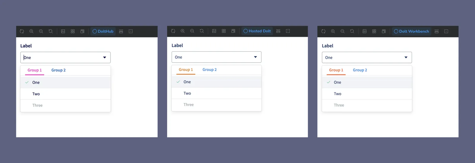
We have four web apps: DoltHub, DoltLab, Hosted Dolt, and Dolt Workbench. Each of these applications has its own version of the same Dolt database UI with a few different styles and features.
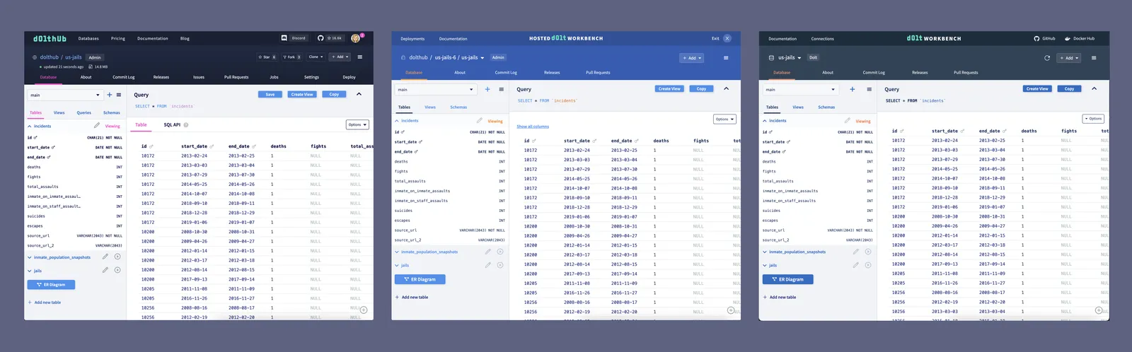
DoltHub was our first web application, and it shares the same code as DoltLab. When we created Hosted Dolt in 2022, we thought about how we could share React components and other code with DoltHub since there would be some overlap. We ultimately decided for the sake of time to hard fork the DoltHub code and make the necessary changes for Hosted. We made this same decision when we created the Dolt Workbench last year, which is essentially an open source version of the Hosted Dolt workbench for any MySQL or Postgres database.
Now that some time has passed and our web products are launched and ready for customer use, we’re going back and building out a library to share React code between our apps.
As you can see from the image above, we mostly use color to distinguish the look and feel of each application. We use TailwindCSS to create a color theme for each application. This has made it easier to handle different colors for the same component between applications when we were copying front end code.
In order to build a shared React component library, we needed the ability to configure different Tailwind color themes for the shared components for each application. Luckily, we had already made some of these changes for the DoltHub React code base when we launched custom colors for DoltLab Enterprise last year.
We now have moved this Tailwind theme configuration to our React library. This blog will walk you through how Tailwind themes work and how you can set up dynamic Tailwind themes for your own application.
Goal#
We want to deduplicate our components in our three React applications by moving them to a shared React component library. Colors vary between our applications and we want our components to have the correct color without needing to pass down different color variants as props.
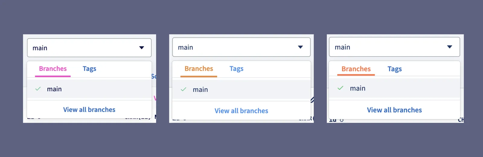
For example, take this FormSelect component. Each application has its own accent color,
which is used to indicate the active tab in the dropdown: pink for DoltHub/DoltLab, and
different shades of orange for Hosted Dolt and Dolt Workbench.
❌ This is an example of how we do NOT want our component library to handle different colors:
type Props = {
  tabColor: "pink" | "orange" | "redorange";
};

export default function FormSelect(props: Props) {
  return (
    <div>
      <div className={`text-${props.tabColor}`}>[tabs code here]</div>
      [...the rest of the FormSelect code]
    </div>
  );
}
Every instance of FormSelect in our applications would need to specify a tabColor.
✅ This is how we DO want our component library to handle different colors:
export default function FormSelect() {
  return (
    <div>
      <div className="text-accent-1">[tabs code here]</div>
      [...the rest of the FormSelect code]
    </div>
  );
}
We can define a color value for accent-1 in each application and it will apply when we
use that Tailwind class.
How it works#
We can achieve the above using CSS
variables. In each
application, we will define our CSS variable as a channel for color accent-1 and apply
it to our root style.
/* dolthub/styles/main.css */
@layer base {
  :root {
    --color-accent-1: 252, 66, 201;
  }
}
And then in our React component library, we will include the color space in our Tailwind configuration, which will be used in each application.
// components/tailwind.config.ts
import { Config } from "tailwindcss";

const config: Config = {
  theme: {
    extend: {
      colors: {
        "accent-1": "rgba(var(--color-accent-1), <alpha-value>)",
      },
    },
  },
};
Then when we use text-accent-1 in our FormSelect it will apply the color based on the
--color-accent-1 CSS variable we define in each application.
For some applications, this Tailwind guide will be enough to handle color themes in a shared component library. However, we need the ability to set our Tailwind color theme dynamically based on environment variables. If this applies to you, read on.
Implementing dynamic color themes#
As I mentioned earlier, DoltHub and DoltLab share the same code, and DoltLab Enterprise has a feature where administrators can set custom colors via environment variables for their application. This means that we cannot simply define CSS variables for colors in our main CSS file. We need to dynamically set the theme based on environment variables. Luckily, we found this very helpful article to get us started.
These are the main parts we will need to implement:
- A React context that applies CSS variables to an application’s
root.style - A base Tailwind configuration that defines the color space
- A place to create the color themes for each application
We will walk through how we implemented each of the above, using our accent-1 color as an example.
1. Create a React context that applies CSS variables to an application’s root.style#
This is the part that leans heavily on this
article.
In our React library we define a React
context
that takes some CSS variables and applies them to the application’s root.style.
First, we define some types:
// components/tailwind/types.ts

// Defines the color channels. Passed to the context from each app.
// i.e. {"rgb-accent-1": "252 66 201"}
export interface IThemeRGB {
  "rgb-accent-1"?: string;
}

// Name of the CSS variables used in tailwind.config.ts
export interface IThemeVariables {
  "--color-accent-1": string;
}

// Name of the defined colors in the Tailwind theme
export interface IThemeColors {
  "accent-1"?: string;
}
Then we create a
ThemeProvider
that takes the IThemeRGB (which is passed as a prop), converts it to a CSS variable, and
applies the variable to the root.style.
// components/tailwind/context/index.tsx
import React, { createContext, useEffect, useMemo } from "react";
import { IThemeRGB } from "../types";
import applyTheme from "./applyTheme";

type Props = {
  children: React.ReactNode;
  themeRGB?: IThemeRGB;
};

type ThemeContextType = {
  themeRGB: IThemeRGB;
};

const ThemeContext = createContext<ThemeContextType>({
  themeRGB: {} as IThemeRGB,
});

export default function ThemeProvider(props: Props) {
  // Note: if you want switch themes on demand, you should
  // add `props.themeRGB` to the dependency array
  useEffect(() => {
    applyTheme(props.themeRGB);
  }, []);

  const value = useMemo(() => {
    return { themeRGB: props.themeRGB };
  }, [props.themeRGB]);

  return (
    <ThemeContext.Provider value={value}>
      {props.children}
    </ThemeContext.Provider>
  );
}
// components/tailwind/context/applyTheme.ts
import { IThemeRGB, IThemeVariables } from "../types";
export default function applyTheme(themeRGB: IThemeRGB) {
const themeObject: IThemeVariables = mapTheme(themeRGB);
const root = document.documentElement;
Object.keys(themeObject).forEach((v) => {
const propertyVal = themeObject[v as keyof IThemeVariables];
const validation = validateRGB(propertyVal);
if (!validation) {
throw new Error(`Invalid RGB value for ${v}: ${propertyVal}`);
}
root.style.setProperty(v, propertyVal);
});
}
function mapTheme(rgb: IThemeRGB): IThemeVariables {
return {
"--color-accent-1": rgb["rgb-accent-1"] ?? "",
};
}
function validateRGB(rgb: string): boolean {
if (!rgb) return true;
const rgbRegex = /^(\d{1,3}),\s*(\d{1,3}),\s*(\d{1,3})$/;
return rgbRegex.test(rgb);
}ThemeProvider should wrap every page in your application. We use
Next.js and put it in our pages/_app.tsx file:
import { ThemeProvider } from "@dolthub/react-components";
import { withApollo } from "@lib/apollo";
import App from "next/app";
import { ReactNode } from "react";
import "../styles/global.css";

type Props = {
  children: ReactNode;
};

export default class DoltHub extends App {
  public render() {
    const { Component, pageProps } = this.props;

    const WrappedPage = withApollo()(Component);
    return (
      <ThemeProvider themeRGB={{ "rgb-accent-1": "252, 66, 201" }}>
        <WrappedPage {...pageProps} />
      </ThemeProvider>
    );
  }
}
2. Create a base Tailwind configuration that defines the color space#
Now we create a base color configuration in our React library. We’ll want to merge this with each individual application’s Tailwind configuration.
The base configuration should define the color space.
// components/tailwind/base/colors.ts

const staticColors = {
  // define any static colors that will have the same value for all apps
};

const configurableColors: IThemeColors = {
  "accent-1": withOpacity("--color-accent-1"),
};

function withOpacity(variableName: keyof IThemeVariables): string {
  return `rgba(var(${variableName}), <alpha-value>)`;
}

const colors = { ...staticColors, ...configurableColors };
export default colors;
We created a mergeConfig utility function in our React library that can merge any Tailwind configuration with our base colors:
// components/tailwind/mergeConfig.ts
import merge from "deepmerge";
import { Config } from "tailwindcss";
import breakpoints from "./theme/base/breakpoints";
import colors from "./theme/base/colors";
import plugins from "./theme/base/plugins";
import typography from "./theme/base/typography";

const reactComponentsTailwindConfig: Config = {
  plugins,
  theme: {
    extend: {
      transitionProperty: { width: "width" },
      gradientColorStops: colors,
      colors,
      fontFamily: typography,
      screens: breakpoints,
    },
  },
};

/**
 * Merge @dolthub/react-components and Tailwind CSS configurations
 */
export function mergeConfig(tailwindConfig: Config): Config {
  const merged = merge(reactComponentsTailwindConfig, { ...tailwindConfig });
  return merged;
}
We can use this in our tailwind.config.ts in each of our applications.
// dolthub/tailwind.config.ts
import { mergeConfig } from "@dolthub/react-components";

const dolthubColors = {
  /* any other colors specific to this app */
};

const config = mergeConfig({
  theme: {
    extend: {
      gradientColorStops: dolthubColors,
      colors: dolthubColors,
    },
  },
  content: [
    // Add content
  ],
});

export default config;
3. Creating the color themes for each application#
Now that we have the ability to dynamically change Tailwind themes for our applications, we decided to move the color themes for each application to our React library. This gives us the ability to test our shared components in Storybook and view what they look like with different color themes. It’s also nice to have everything in one place.
You can see here in our themes
folder
we have a place for each of our web applications where we have defined their colors. The
DoltHub colors are our base
colors.
Our Hosted Dolt application uses a different definition for accent-1:
// components/tailwind/themes/hosted
export const tailwindColorTheme: IThemeRGB = {
  "rgb-accent-1": "237, 137, 54", // ld-orange
};
We export this from the React library and pass it to our ThemeProvider in our Hosted
application’s pages/_app.tsx.
import { ThemeProvider, hostedRGBColors } from "@dolthub/react-components";
import { withApollo } from "@lib/apollo";
import App from "next/app";
import { ReactNode } from "react";
import "../styles/global.css";

type Props = {
  children: ReactNode;
};

export default class Hosted extends App {
  public render() {
    const { Component, pageProps } = this.props;

    const WrappedPage = withApollo()(Component);
    return (
      <ThemeProvider themeRGB={hostedRGBColors}>
        <WrappedPage {...pageProps} />
      </ThemeProvider>
    );
  }
}
Now you have everything you need to create your own dynamic Tailwind themes.
Viewing results using Storybook#
There are two ways you can see your new color themes in action:
- Wrapping your application with
ThemeProviderand importing a shared component that uses one of your custom colors - Viewing your shared components in Storybook
In order to apply dynamic Tailwind themes to our components in Storybook, we must wrap
every story in ThemeProvider. We can do this in .storybook/preview.tsx using
decorators.
// components/.storybook/preview.tsx
import { Preview } from "@storybook/react";
import React from "react";
import "../src/styles/global.css";
import ThemeProvider from "../src/tailwind/context";
const preview: Preview = {
decorators: [
(Story) => (
<ThemeProvider>
<Story />
</ThemeProvider>
),
],
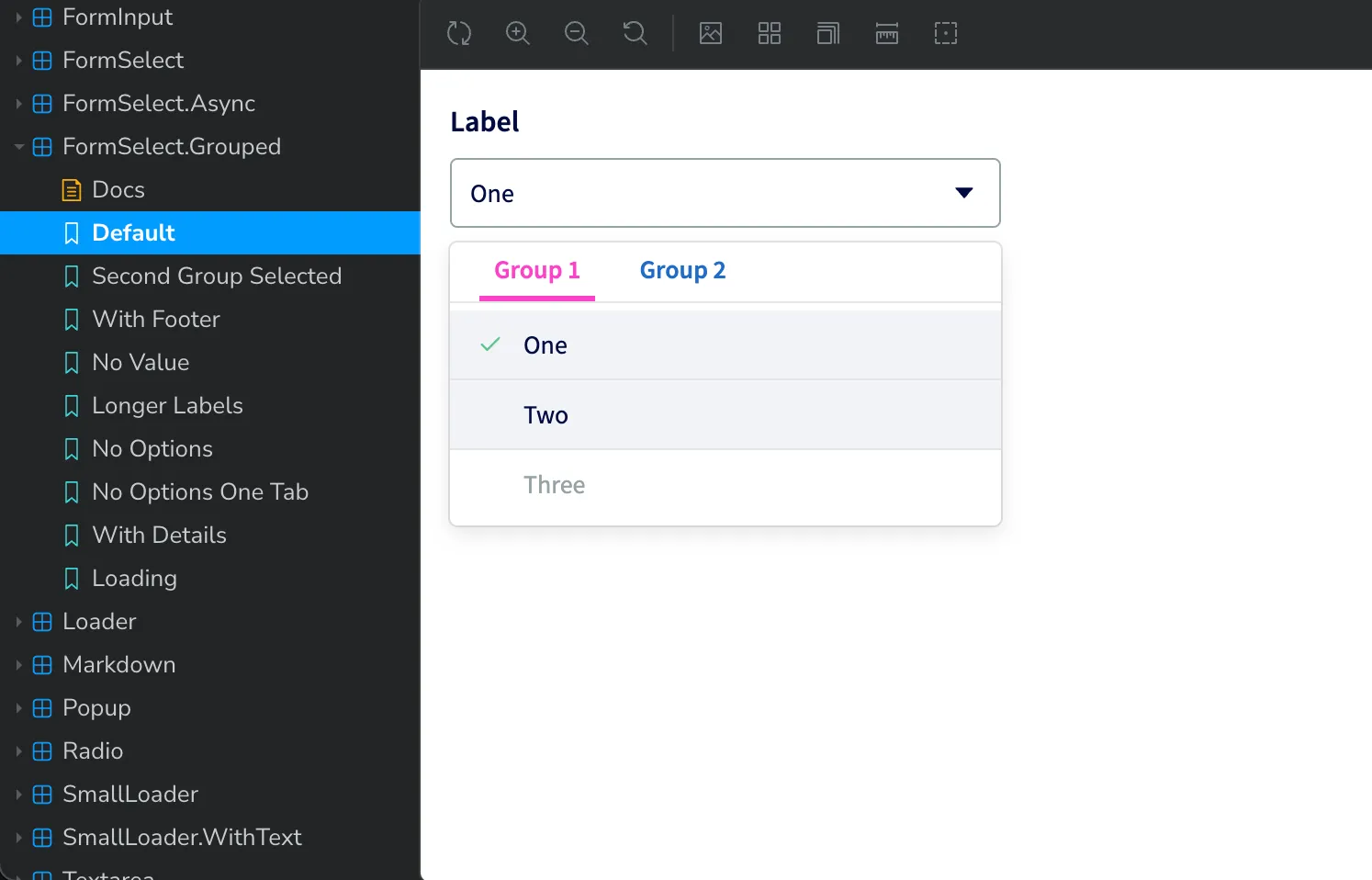
};When we run storybook dev, we will see the component that looks like this, with the pink
base accent color.
However, when I’m working on this component, I also want to see what it would look like with other color themes. We can add a theme switcher to Storybook to allow toggling between different Tailwind themes.
First, we add a toggle button to the toolbar in .storybook/preview.tsx.
// components/.storybook/preview.tsx
import { Preview } from "@storybook/react";
import React from "react";
import "../src/styles/global.css";
const preview: Preview = {
globalTypes: {
theme: {
name: "Theme",
description: "Global theme for components",
defaultValue: "dolthub",
toolbar: {
// The icon for the toolbar item
icon: "circlehollow",
// Array of options
items: [
{ value: "dolthub", title: "DoltHub" },
{ value: "hosted", title: "Hosted Dolt" },
{ value: "workbench", title: "Dolt Workbench" },
],
dynamicTitle: true,
},
},
},
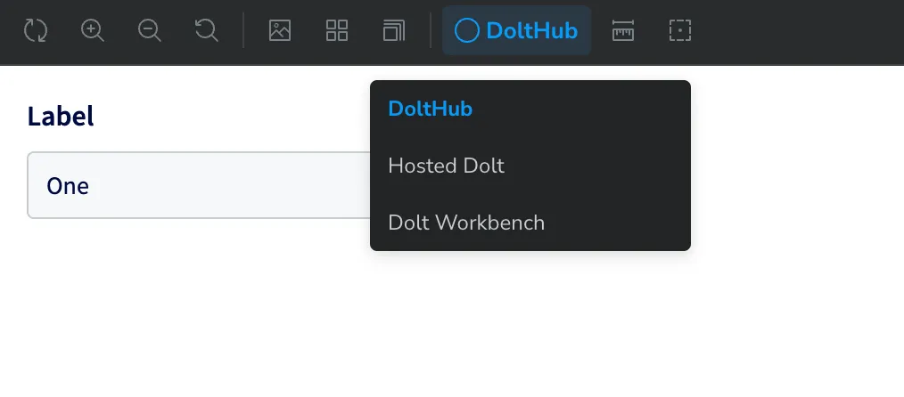
};It will look like this:
Then we adjust our decorators to switch the Tailwind theme based on the selected theme
from the toolbar.
import { Preview } from "@storybook/react";
import React from "react";
import "../src/styles/global.css";
import ThemeProvider from "../src/tailwind/context";
import { baseColorVariableValues } from "../src/tailwind/theme/base/colors";
import { tailwindColorTheme as hostedTheme } from "../src/tailwind/theme/hosted/colors";
import { tailwindColorTheme as workbenchTheme } from "../src/tailwind/theme/workbench/colors";
import { IThemeRGB } from "../src/tailwind/types";

const preview: Preview = {
  globalTypes: {
    // same as above
  },
  decorators: [
    (Story, context) => {
      // Will default to the theme specified in an individual story
      const theme = context.args.theme ?? context.globals.theme;
      return (
        <ThemeProvider themeRGBOverrides={getTheme(theme)}>
          <Story />
        </ThemeProvider>
      );
    },
  ],
};

function getTheme(theme: string): IThemeRGB {
  switch (theme) {
    case "hosted":
      return hostedTheme;
    case "workbench":
      return workbenchTheme;
    default:
      return baseColorVariableValues;
  }
}

export default preview;
Now when we run Storybook, we can use the toolbar to switch themes for our FormSelect
component!
Conclusion#
You now know how to create Tailwind themes dynamically and view them using Storybook. We use this to set our Tailwind themes in DoltHub using environment variables, but there are many other applications, such as letting users define their own colors and themes.
Have questions or feedback? Find me (@taylorb) in our Discord.