Where is dynamite hidden in the US housing market?

I'm currently staring at what I think might be the biggest open database of housing sales records ever. It's 50GB of uncut housing sales records straight from the government coffers. Tens of millions of them. Good chance to dig around and play with a new dataframe library (polars), maybe.
I pooled this data with the help of our experimental data bounties project at DoltHub, something that anyone can join, even you! Basically, Dolt works like Git. When bounty hunters make pull requests, they're doing it to edit a Dolt database instead of a codebase. We built our table of housing sales records this way, one PR at a time. (DoltHub pays out around $10-15k per database to our bounty hunters as a marketing expense. If you're sharp and good at Python, you can probably make a few grand. More info on our Discord.)
Even though my job at DoltHub is to design and organize the bounties, a question still burns deep inside me: what can I do with this cool data that I've got our hands on? This series of microblogs is my attempt to answer that question. Basically the idea is to LARP as a data analyst and see what I can find.
(By the way, if you have any suggestions on what kind of analysis I should do next, or comments on this one, drop me a line at alec@dolthub.com and help me keep my job!)
In an earlier blog I tried to draw some conclusions about the housing market as a whole. There's quite a bit we can say about that, but as a non-expert in housing, I was surprised to discover (when I played around with the data) that the market is a lot more granular than you'd think. Talking about the housing market is a lot like talking about the weather. There are global, long-term trends, but that doesn't always tell you what's gonna happen right above you, tomorrow.
(All of these plots were generated with polars, matplotlib and Dolt. To see the code, click the expandable parts below.)
What I did was look at the city-wide data that we had. I picked the most abundant cities in our dataset to get the best statistics (sometimes large cities, sometimes medium-sized) and looked at how their sales changed over time.
(In order to clean the data, I took the median yearly sale price for each city, and excluded houses that were way outside that range.)
Click to see code
  # Clone the dataset
  # > sudo curl -L https://github.com/dolthub/dolt/releases/latest/download/install.sh | sudo bash
  # > dolt clone dolthub/us-housing-prices
  # Then change directory into that folder, fire up a sql server on the command line with
  # > dolt sql-server
  # and then open this up in a script or a notebook
  # I use `polars` instead of `pandas` for the convenient syntax and speed.
  import matplotlib as mpl
  import matplotlib.pyplot as plt
  import numpy as np
  import polars as pl

  # Turn this on for higher DPI on images
  mpl.rcParams['figure.dpi'] = 200

  # Plotting colormaps
  from matplotlib import cm
  import matplotlib.dates as mdates

  to_select   = 'dwelling|home|family|residence|residential|plex|resid'
  to_unselect = 'mobile|parking|day care|daycare|nursing|church|garage'

  # We want to filter out mobile homes, parking lots, etc.
  # But keep major housing types (except condos)

  df = (
      pl.scan_csv('sales.csv')
      .with_columns([
          pl.col('city').str.to_uppercase(),
          pl.col('sale_date').str.strptime(pl.Datetime, fmt = "%Y-%m-%d %H:%M:%S %z %Z", strict = False)
      ])
      .filter(pl.col('property_type').str.to_lowercase().str.contains(to_select))
      .filter(~pl.col('property_type').str.to_lowercase().str.contains(to_unselect))
      .filter((pl.col('sale_price') > 55_000) & (pl.col('sale_price') < 10_000_000))
      .filter(~pl.col('physical_address').str.contains('^0 |^- |^X'))
      .filter(pl.col('physical_address').str.lengths() > 5)
  ).collect()

  df = (df
    .filter(pl.col('city') != '')
    .filter((pl.col('sale_date').dt.year() >= 2010) & (pl.col('sale_date').dt.year() <= 2019))
  )

  df_top_cities = (
      df.with_columns([
          pl.col('sale_price').median().over(['city', 'state', pl.col('sale_date').dt.year()]).alias('yearly_sale_median'),
          pl.lit(1).count().over(['city','state']).rank(method = 'dense', reverse = True).alias('group_rank')
      ])
      .filter(pl.col('group_rank') <= 12)
      .filter((pl.col('sale_price') < 10*pl.col('yearly_sale_median')) & (pl.col('sale_price') > .1*pl.col('yearly_sale_median')))
      .drop(['yearly_sale_median', 'group_rank'])
  )

  data = (df_top_cities
          .groupby([
                  'city',
                  'state',
                  pl.col('sale_date').dt.year().alias('sale_year'),
                  pl.col('sale_date').dt.month().alias('sale_month')
          ])
          .agg(pl.col('sale_price').mean())
          .with_column(
              pl.lit(1).alias('sale_day')
          )
          .with_column(
              pl.datetime(pl.col('sale_year'), pl.col('sale_month'), pl.col('sale_day')).alias('sale_date')
          )
      )

  fig, ax = plt.subplots(figsize = (10, 6))

  markers = ['d', 'v', 's', '*', '^', 'd', 'v', 'o', '<', '^', '1', '2']

  for i, group in enumerate(data.groupby('city')):
      ax.scatter(
          group['sale_date'].dt.epoch_days(),
          group['sale_price_mean'],
          label = f"{group['city'][0].title()}, {group['state'][0]}",
          s = 8,
          marker = markers[i])


  locator = mdates.YearLocator(2)
  ax.xaxis.set_major_locator(locator)

  formatter = mdates.AutoDateFormatter(locator)
  ax.xaxis.set_major_formatter(formatter)

  ax.set_yticks([0, 250_000, 500_000, 1_000_000, 1_500_000])
  ax.set_yticklabels(['0', '$250k', '$500k', '$1M', '$1.5M'])
  ax.set_ylim([0, 1_500_000])

  ax.set_ylabel('average sale price')

  plt.title('Monthly average home sale price, 2010-2020, major cities')
  plt.legend(fontsize = 9)

  plt.show()
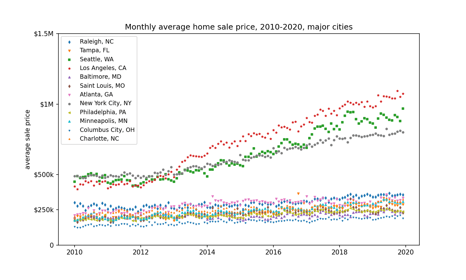
These are the top 10 cities (by number of sales) that we have in our dataset. You can see that although the market as a whole is drifting up, some cities are just getting ready to blow.
Let's quantify the TNT by fitting an exponential to each group.
Click to see code
from scipy.optimize import curve_fit

  def exp_func(x, a, b):
      return a * np.exp(b * x)

  fit_guess = [100_000, .0001]

  scores = []

  for group in data.sort('sale_date').groupby('city'):
      # Note: the "-15000" is because the fit function doesn't like big numbers
      xs = (group['sale_date'].dt.epoch_days() - 15_000).to_list()
      ys = (group['sale_price_mean']).to_list()
      fit_params, pcov = curve_fit(exp_func, xs, ys, fit_guess)

      scores.append(tuple((group['city'][0], group['state'][0], *fit_params)))

  scores = sorted(scores, key = lambda x: x[3], reverse = True)

  from labellines import labelLine, labelLines

  fig, ax = plt.subplots(figsize = (10, 10))

  xs = range(data['sale_date'].dt.epoch_days().min(),data['sale_date'].dt.epoch_days().max())

  for city, state, init_price, app_rate in scores:
      ax.plot(xs,
          # we need to add back the 15000 here
          [exp_func(x-14000, init_price, app_rate) for x in xs],
          label = f"{city.title()}, {state} ({round(app_rate*365*100, 1)}%)",
          # rescale the colors so that they look nice
          color = cm.plasma(app_rate*3000))

  xvals = [17800, 17500, 16500, 16000, 17000, 16500, 15000, 17500, 16000, 17000, 17000, 17800]
  labelLines(ax.get_lines(), align=True, xvals = xvals, fontsize=8)

  plt.yscale('log')

  locator = mdates.YearLocator(2)
  ax.xaxis.set_major_locator(locator)

  formatter = mdates.AutoDateFormatter(locator)
  ax.xaxis.set_major_formatter(formatter)

  ax.yaxis.set_major_formatter(mpl.ticker.ScalarFormatter())

  ax.set_yticks([0, 250_000, 500_000, 1_000_000, 1_500_000])
  ax.set_yticklabels(['0', '$250k', '$500k', '$1M', '$1.5M'])

  ax.set_ylim([100_000, 1_500_000])

  ax.set_ylabel('estimated home value')
  plt.title('Change in average home sale price, 2010-2020, major cities')

  plt.show()
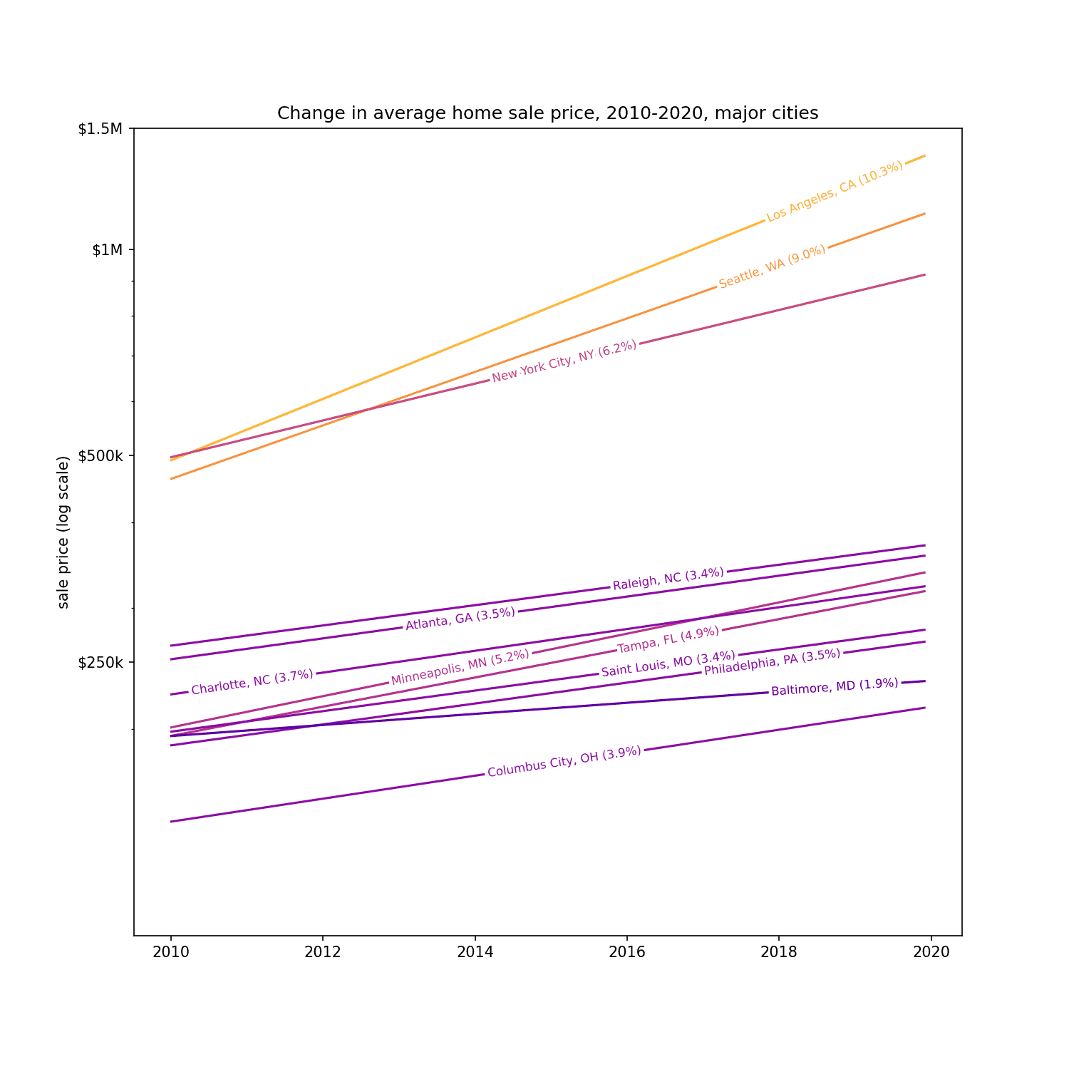
(Note that this is a log scale chart, and the straight lines indicate exponential growth.)
The only city exploding faster than Seattle is Los Angeles, with property values going up about 10% a year. What in the world is going on there? It's no wonder everyone's leaving LA, it's getting crowded there.
So I learned something. Just because the housing market is rising, doesn't mean it's rising uniformly. If anything there appear to be two distinct markets: one where housing prices are rising modestly, and one where they are just exploding. There's TNT in the big cities (LA, Seattle, NYC) where housing prices are already expensive (the correlation between the hotness of the market and the mean sale price.)
Let's at how a hypothetical $500k house appreciates in different major cities.
Click to see code
  from labellines import labelLine, labelLines

  fig, ax = plt.subplots(figsize = (10, 6))

  xs_min = data['sale_date'].dt.epoch_days().min()
  xs_max = data['sale_date'].dt.epoch_days().max()
  xs = range(xs_min, xs_max)

  app_rates = []
  for city, state, init_price, app_rate in scores:
      if any([((app_rate <= x*1.1) and (app_rate >= x/1.14)) for x in app_rates]):
          continue
      app_rates.append(app_rate)
      ax.plot(xs,
          [exp_func(x-xs_min, 500_000, app_rate) for x in xs],
          label = f"{city.title()}, {state} ({round(app_rate*365*100, 1)}%)",
          # rescale the colors so that they look nice
          color = cm.plasma(app_rate*3000))

  xvals = 12*[17800]
  labelLines(ax.get_lines(), align=True, xvals = xvals, fontsize=8)

  locator = mdates.YearLocator(2)
  ax.xaxis.set_major_locator(locator)

  formatter = mdates.AutoDateFormatter(locator)
  ax.xaxis.set_major_formatter(formatter)

  ax.yaxis.set_major_formatter(mpl.ticker.ScalarFormatter())

  ax.set_yticks([0, 250_000, 500_000, 750_000, 1_000_000, 1_250_000, 1_500_000])
  ax.set_yticklabels(['0', '$250k', '$500k', '$750k', '$1M', '$1.25M', '$1.5M'])

  ax.set_ylim([0, 1_500_000])

  plt.grid(visible='True', axis = 'y')

  ax.set_ylabel('sale price (log scale)')
  plt.title('Hypothetical growth of a $500k house from 2010-2020, major cities')

  plt.show()
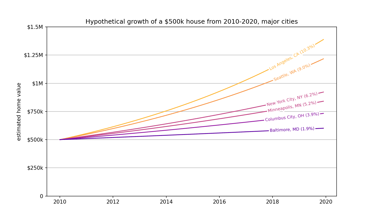
If you moved to LA in 2010, you earned $80k a year just sitting at home. The same house in Baltimore appreciated just $10k a year in the same period. Heck of a way to make a living!
This data is all freely available on DoltHub for you to look at, play with, and give me ideas for! To get it, get a copy of Dolt with:
sudo curl -L https://github.com/dolthub/dolt/releases/latest/download/install.sh | sudo bashand then
dolt clone dolthub/us-housing-pricesThat's it!