
About this bounty#
For our latest bounty we’ve been pretty ambitious. We asked our community to go out and scrape as many housing sales records as they can find, and after the bounty finished, we topped out at 50 GB of sales data. That is a lot of sales, over 50 million records actually. Data that big comes at a cost: it’s not clean, it’s not organized, and it’s not necessarily normalized either. But let’s see what we can take away from this unpolished data.
You can download this data if you want to play with it. Tell us what you find! You can also look over the notebook that was used to generate this data.
You’ll need Dolt to clone this dataset. DoltDB was what enabled us to do this kind of collaborative data collection.
Our coverage#
By comparing our map of ZIP codes collected to a population-density map, you can see our dataset has hotspots roughly what you’d expect based on a population map. We picked up a nice cross section of the housing market without biasing ourselves too much towards one region, though some parts are overrepresented in the data. Some cities provide sales records going back decades, while others only allow you to search the past few years.

Distribution of ZIP codes we collected. Coloring is logarithmic with number of counts.

A population map for comparison. Source
Signing season#
Take a look at this scatterplot of all the housing sales records in our database. What do you see?

Scatterplot of all sales in our database.
2008#
One feature of the data which probably stands out right away is the ramp up to the pop of the 2008 housing bubble. Between the years 2000 and 2008 you see a cluster of dots shooting up like Icarus and then vanishing. In that same wild region you can notice that sales of affordable housing plummet. So it wasn’t simply that some housing prices increased, but rather all housing prices increased. Buyers and sellers were frantically playing a game of musical chairs where even the cheapest chair came with a steep price tag. After the music stopped and the bubble burst, housing prices fell again and the market dried up for a while, as shown by the lightening of the scatterplot around 2008-2009.
Price ceilings and floors#
When it comes to buying a house we often start out with a limit on how much we’ll spend. You might say to your partner “We cannot afford to spend more than $300,000”, or maybe your limit is $1,000,000, but the point is that everybody has a rough idea of how much they plan to will spend and budget accordingly. That’s their ceiling price. Any amount over that predecided ceiling value could be a dealbreaker for the buyer, and the seller, whose interest is in making the deal, might come down a hair to meet them there.
But what does any of this have to do with the chart that we see? You can actually see this effect on the chart of all sales. Look at the horizontal line representing $1 million. You can see that there are very few points directly above that line but comparatively more below it and on it. This suggests that few houses sell for just above $1 million, which could be an example of the ceiling effect. A person says to their agent, “We like the house, but won’t spend more than $1M.” The seller, who has valued his property previously at $1.05M, decides to come down and make the sale. In the end, it’s a small price to pay for a sure thing.
There’s a similar, but opposite, effect happening towards the bottom of the graph which you could call the floor effect. Look near the $100k line. When there’s a price floor, it’s the seller who is refusing to sell for less than a certain amount, and near a price floor you should expect to see a sharp transition from more sales to fewer sales as you go from above it to below it.
To me, it’s fascinating that housing prices could be decided purely around an attachment to numbers that just happen to look nice and round in our particular decimal system. It’s a sign that human psychology is very much still at play in the housing market. As humans rely more on computers to buy and sell homes, maybe the ceiling and floor effects will go away. In the meantime, if you’re a buyer looking to clinch a deal, don’t be afraid to offer just a token amount (say $5) above one of those nice, round numbers. It may be what sets you apart from the other buyers.
‘Tis the season?#
The scatterplot reveals seasonal fluctuations in demand, where the distribution of sales tends to be denser towards the middle of any given calendar year. The number of houses that are sold rises in the summer and falls to a minimum in the winter. We apparently come out of hibernation in March, scurry around looking for houses, and then settle in by November. When it comes to the holiday season, we’d rather be home than be looking for one.


But then a thought comes to mind: is it possible to take advantage of this trend to find a cheaper house? After all, if the market is cooler in the winter for buyers, maybe there’s less competition to drive up the price.
Home for the holidays?#
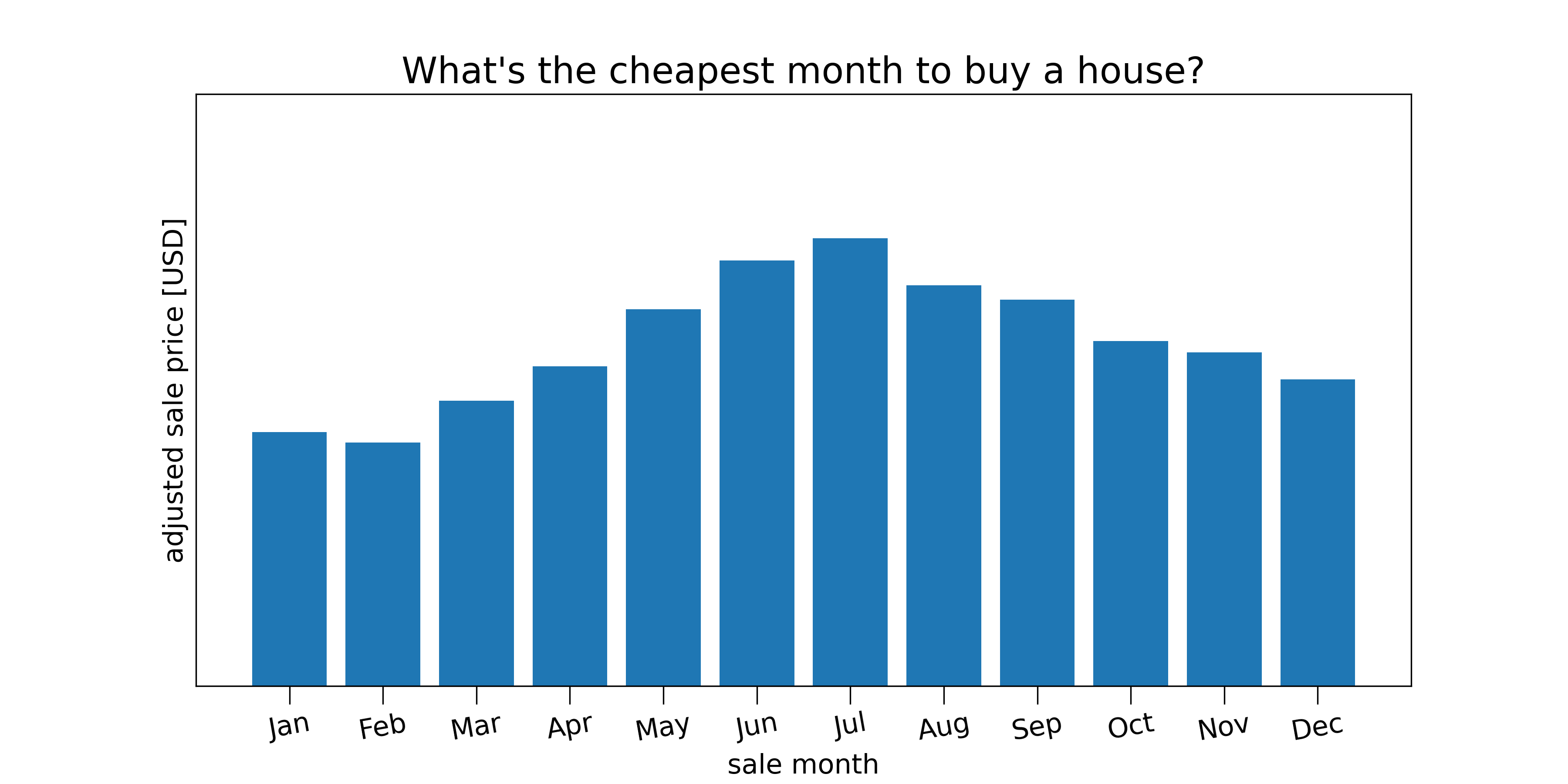
Think about how you might go about calculating the most the cheapest months to buy a house. You might start by grouping sales by month and taking the average price in each month. But if you did that you would find one month is usually the most expensive: December. This contrasts with our intuition, as we just learned that the housing market is most active in the summer, and higher competition for houses should drive up the price of housing. So what went wrong? The answer is that there’s a confounding effect: the slow, upward drift in housing prices.
If the upward drift is large enough, then within any given year, December will always be the most expensive month to buy a house. In reality it’s not quite that large, but we do need to subtract off the slow increase in order to get a realistic picture of the seasonal fluctuation. When we subtract off the upward drift, we see a clear seasonal variation in sale prices: summer is the most expensive time to shop, whereas winter is the cheapest.
Save with pre-owned?#
Our database also collects information on zip codes, property types, and the year that a property is built in. In order to look at homes specifically, for example, I filtered down the property type column to include anything “residential-ly” — “family”, “residential”, “condo”, etc. We can similarly filter by year_built. Is there an accelerating demand for newer homes — which might be more lifestyle appropriate to first-time buyers — or are people chasing after older homes which might be a safer investment? And of these two choices, which are actually appreciating faster?
The data gives us a few hints. Houses built before 1985, which are pretty old by today’s standards, are actually rising in price faster than newer homes. What does this tell us about those older properties? It’s not that older houses are worth more per se, as it appears that all other things being equal, newer houses get a premium in the marketplace.

Newer houses, all other things being equal, are more expensive than older ones. Though it’s not clear to me what’s happening at age = 0.
Could there be a relationship between the year in which our house was built and its location? Maybe older homes are rising faster in price because they’re simply located in a hotter market. We leave this as curiosity to the reader to figure out.
City vs country#
We don’t have quite enough information in our database alone to figure out whether a house is zoned in a rural or urban area, but we can leverage data from the Census Bureau and the Department of Agriculture to get an estimate of how rural any given ZIP Code is. What we find is that urban-zoned homes follow a difference price trajectory compared to the most rural ones.

Who’s getting rich?#
For many people houses are seen as an investment and not as a commodity. When people buy a house they’re expecting it to go up in value. So how much does it go up in value? What kind of rate of return can someone see on a house that they bought in the last decade? The answer is not so simple.
What we found in our analysis is that the average, commodity-style houses increase in value at a rate of 4% per year. (These are houses that cost around $400,000.)

But if you look at houses which are more expensive, say, in the range of $1 million or more, those houses appreciate more slowly, at a rate of about 2% per year on average.

What story can you tell here? If demand drives appreciation, then we’re seeing a dramatic rise in demand for middle-class housing, with comparatively stable demand for luxury housing. (I’d be interested in hearing your inferences.)
I decided to dig around for the ZIP code in LA with the highest rate of appreciation. In the process, I computed the exponential increase in sales prices over the last decade for every zip code in LA. This led to a couple pretty surprising findings.

Map of property appreciation rates in LA. Black means no data. Sometimes the exponential model didn’t fit the data well and led to abnormally small/large appreciation rates. We leave it to the reader to try to do a better job.
Most of the acceleration in prices is happening near central LA (like Koreatown, East Wilshire), and not in the luxury residential areas like Sherman Oaks, Orange County, or Malibu. And when I sorted by quickest-appreciating ZIP code, I ended up with 90032. I was sure this would be a well-known area, but this ZIP code belongs to Omaha Heights, a nondescript part of East LA that’s near nowhere famous in particular. In fact, it looks like a plain residential area, mainly near schools and parks.

The big fish#
So who’s buying these houses? The answer is for the most part: normal people. However there are real estate firms that are buying houses at increasingly high rates. From the buyer column in our dataset we can see that Zillow bought the greatest number of homes in our entire dataset during the pandemic last year.
| buyer | year | counts |
|---|---|---|
| D R HORTON INC | 2021 | 1432 |
| NVR INC | 2021 | 1744 |
| ZILLOW HOMES PROPERTY TRUST | 2021 | 1855 |
A better analysis would use grouping based on similar strings and not exact matches. We leave this up to the reader. Since our dataset doesn’t contain buyer information for every house, we can’t say how many properties (as a %) were bought by Zillow. All we can see is their emergence as the most prominent buyer in 2021.
Limitations of this analysis#
One of the limitations of running bounties like this is validation of incoming data. Right now the only validator is me, the guy writing this article. I painstakingly looked through each pull request for mistakes, but when there are millions of rows to analyze, mistakes do get through. We can’t expect perfection either: our community scrapers are primarily people who are looking to make money while learning Python, SQL, and web technologies, grabbing government records that are themselves imperfect.
Secondly, our sales records (up until now) were collected without indicating the type of sale. While most of our sales are true sales, in the sense that they’re a transfer of property from one owner to a different one, many sales records are transfers from a parent to child, or from one spouse to another, or are “unqualified” sales in the sense that the sale does not represent the true market value of the property sold. Collecting data on the kind of sale would have given us extra tools for filtering these sales out.
Another limitation of this data is related to the “lamppost” problem. It comes from an old story of a man in the dark who’s fruitlessly looking for his keys under the light of a lamppost. A passerby asks him why he keeps looking for his keys even though they are clearly not there. He replies, “because that’s where the light is!” In our case, the lamppost is shining on some of the data, but not all of it. Any data that is hard to scrape, like non-electronic records, or records from counties which don’t make their records searchable, won’t be included in our dataset.
A fourth limitation is that our data consists largely of bigger, more transparent counties. Since our community scrapers get paid by the cell, they’re incentivized to go after the biggest hauls, which are a better value to them in terms of time spent. But this can sometimes leave us with data that’s skewed towards a handful of locations.
Looking forward#
We’ve only scratched the surface of what you can do with this data that our community scrapers put together with Dolt. We’d love it if you could show us what you can do with our dataset, which is the biggest open one of its kind.
Again, you can always start from the notebook that was used to generate this data.