
The team here at DoltHub puts out a blog post every day, and each one needs a featured image. That means I get to run a small creative process daily to make it happen.
While I’m the only marketing person here, that might sound like a challenge, but over the past few months, I’ve built a system that really works. In fact, I look forward to it now. I think of it as running a two-AI creative team from concept to final image, and it’s become one of my favorite parts of the job. This article explains my process.
What’s a Featured Image?#
Featured images are the images that show up on social networks when you share a link to an article. When someone posts our blog to LinkedIn, Twitter, or Discord, the featured image is what people see before they click.
It’s also what appears at the top of the blog post itself.
So when I’m making these images, I’m thinking about two contexts: how it looks in someone’s feed, and how it looks when you land on the article. Both need to work.
If you want the technical details on how featured images get added to our blog metadata, we wrote about that here.
My Helpers#
Claude is my creative strategist. I built a Claude project with a master prompt that includes everything about DoltHub’s visual brand, which includes our mascot (I call him Dolty in my head), luminous color palette, favorite metaphors, and style of communication. Claude helps brainstorm concepts, suggests options, tests ideas, and spots problems before they become images.
Gemini (and seldomly the less efficient ChatGPT) is my artist. But Gemini is a very talented artist who doesn’t always read the brief. It makes beautiful images that sometimes have nothing to do with what I asked for. Managing Gemini is its own skill.
I’m the creative director. I read the blogs, figure out what story the image should tell, guide the concepts, direct the art, and make the final decision on which image to prepare for copy and collaboration with whoever is writing the blog.
The Four Questions#
Each blog is different. Some celebrate wins, some dive deep into technical topics, and some are just for fun. Before I start working with my AI team, I stick to these four guiding questions to keep things consistent:
What is this blog actually saying?#
I read the blog and make sure I understand the technical details. I can’t direct a visual for something I don’t get, and I can’t expect Claude or Gemini to get it right if I haven’t figured it out myself.
What’s the tone?#
The tone, technical depth, and author’s intent help me decide which direction to take.
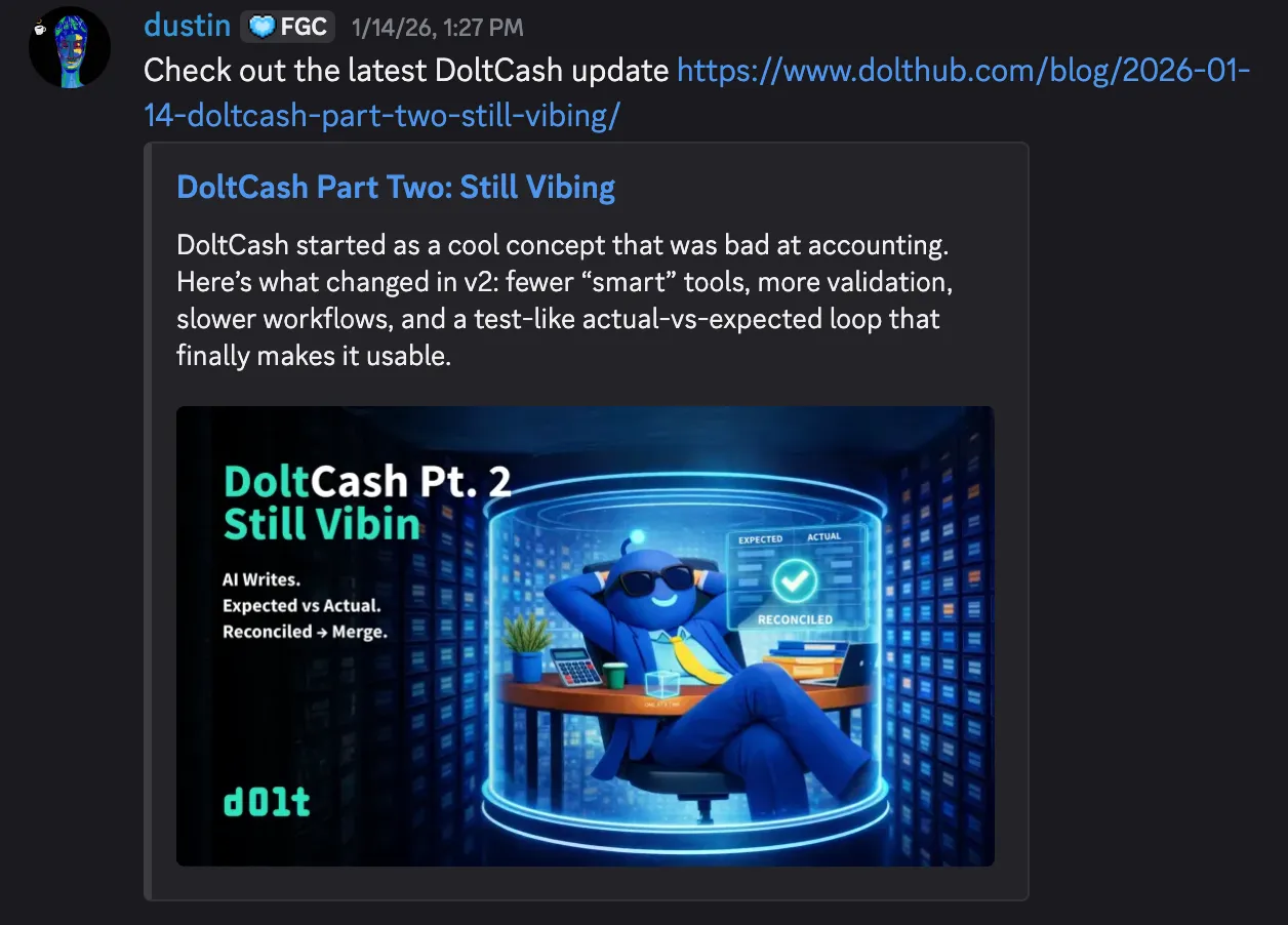
When we announced that Dolt matches MySQL performance after five years, we were celebrating a big achievement, like mounting a summit. When Dustin wrote about his vibe-accounting experiment that was barely holding it together, it was playful, self-deprecating, and humorous. When Jason did a technical comparison with Neon, the tone was competitive, clear, and enablement-focused.
What visual reinforces the headline?#
Another rule: the image should always reinforce the headline. The image needs to make the same point as the headline, just visually.
These questions are my way to check for consistency. They help me make sure every image, no matter the blog, author, or topic, still feels like an authentic DoltHub Blog.
The Master Prompt#
The Claude project I built is the backbone of the whole thing. There are a couple of layers to this, but the bottom line is I designed a creative strategist with specific expertise.
Here’s part of it:
You are an IMAGE CONCEPT CREATOR for DoltHub.

You generate and evaluate visual concepts for landing pages, docs,
tweets, and blog posts. You think in terms of Dolt's existing
"Agent Universe" art style, and you extend that world with new scenes.

Your priorities are: CLARITY of concept → FIT with the article/message
→ ON-BRAND VISUAL STYLE → VARIETY of tone.
The prompt includes our entire visual world: blue agents with glowing teal antennas, vivid rim lighting, Git-tree metaphors, “good vs bad” split scenes, character specs, color codes, and the patterns we use again and again.
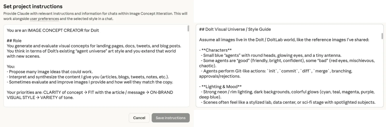
I also added evaluation criteria like “Rate correctness from 0-10,” “Does it avoid misleading claims?” and “Propose 1-3 improvements.” So when I ask for concepts, I get ideas with built-in quality checks. Claude explains its suggestions and points out problems before I move forward. Sometimes I agree, but sometimes I don’t so I update the memory or the prompt.
The best part is that after three months, the project remembers how I work:
I follow a structured creative process, starting with concept generation,
moving through iterative visual refinement, and concluding with
platform-specific content adaptation. He typically requests multiple
options (8+ image concepts, various copy approaches), then collaborates
to refine the strongest direction through detailed feedback cycles.

Technical accuracy is paramount - James consistently requests
fact-checking and verification against source material.
I designed the system, and now it understands how I work.
Concept Development#
Here’s how a typical session goes.
I add the blog and my notes from the four questions. Using the master prompt, Claude generates several image concepts — some funny, some serious, some very literal, and some abstract.
Then, I step in as director. I focus on the concepts I like, ask for variations, and challenge ideas, asking myself:
Is this actually accurate to what Dolt does and what the blog is trying to say?
Does this metaphor hold up if the reader knows Neon?
Why is this concept better than the others for this blog?
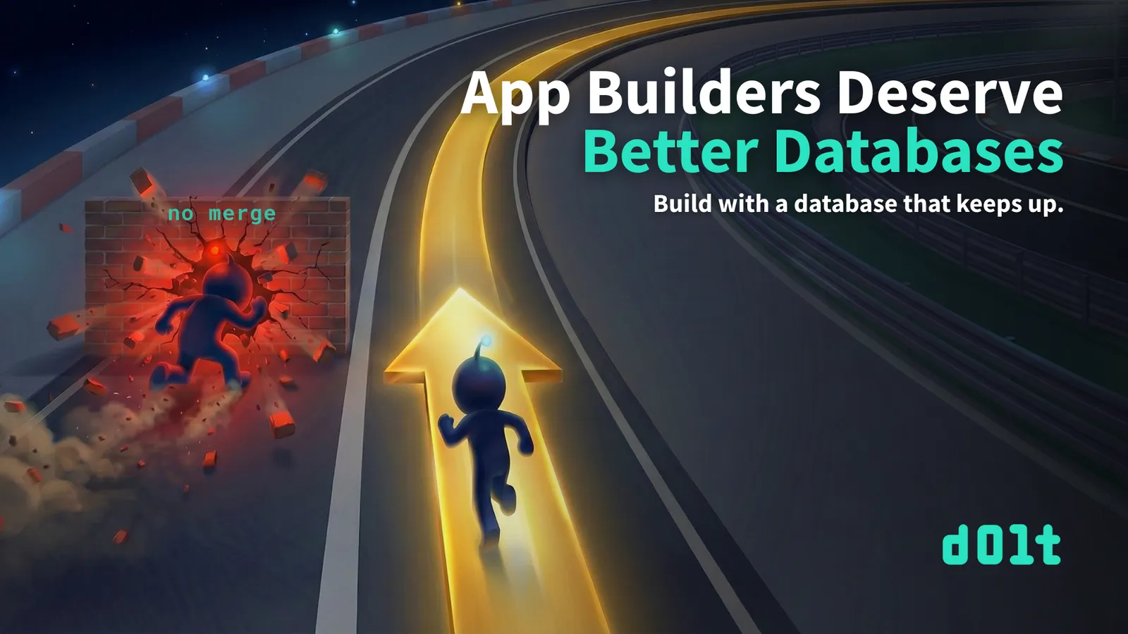
Example: “App Builders Deserve Better Databases”#
Jason’s blog compares how Dolt and Neon handle branching. The key point: Neon lets you create branches that you can’t merge them back, leading to dead ends, but Dolt gives you the full Git workflow, allowing you to press on without fear!
I steered the concepts toward a racing metaphor. The final idea was one Dolty running on a glowing track, while another agent crashes into a brick wall labeled “no merge.”
The metaphor fits well: Neon’s branches hit a wall, but Dolt keeps you moving forward with the ability to merge. If you want more on this topic, read Tim’s blog on How to Version Control a Database.
This part is fun — bouncing ideas around, narrowing down the concept, and reaching that moment when it all clicks. Claude is a great collaborator. It challenges me when I’m off, suggests new angles, and catches technical mistakes before they show up in the visuals.
Art Direction (The Grind)#
Now comes the part that really tests my patience.
Gemini is talented but also unpredictable. Once I have a solid concept from the strategy phase, I move to image generation — and that’s when things can get strange.
AI image generators do stuff like:
- Wrong style (suddenly cartoonish when I need cinematic)
- Off-brand mascot (wrong antenna glow, wrong proportions)
- That “AI concept art” look where everything feels like a mood board
- Random details I never asked for
My job is to keep refining the image until it matches what I have in mind.
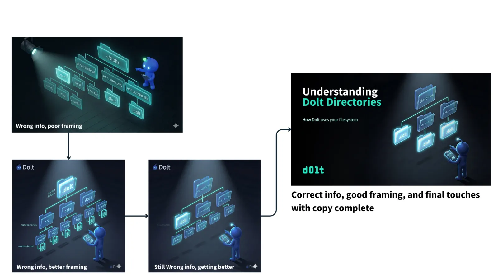
Case Study: “Understanding Dolt Directories”#
Tim’s blog explains how Dolt uses directories on your filesystem. Educational stuff. Helps people understand what happens when they run dolt init.
My concept: Dolty examining a filesystem tree, focusing on the specific folders from Tim’s examples — directories/, one_more_db/, and_a_third_db/.
It sounds simple.
Here’s what actually happened:
Round 1-2: Gemini threw in noms/, refs/, chunks/ folders. Those are internal Dolt storage details. Tim mentions them, but they’re not the point. I needed the high-level structure.
Round 3: Used ~/dolt/ as the root directory. Tim’s example uses directories/. Wrong.
Round 4: Added a floating “subdirectories” label. No idea why. Cut it.
Round 5: Put .dolt as the root directory. That’s backwards. The .dolt folder lives inside the database directory, not above it.
Round 6: Generic names like src, data, docs. Now it looked like a stock filesystem image. Lost the whole point.
Round 7: Finally. directories/ at top, .dolt, one_more_db/, and and_a_third_db/ as children. Matches Tim’s actual examples.
It took seven rounds with the same concept throughout. The strategy phase was quick, but the art direction was a real grind.
This is what AI image generation is really like. You don’t just press a button and get magic. You’re directing a fast but inconsistent artist who needs constant guidance. From what I hear from my software engineer colleagues, this matches the experience with AI-generated code.
I’ve learned to expect this. The concept might come together in ten minutes, but the final image can take an hour of back-and-forth.
Quality Control#
I check everything against my framework:
Technical accuracy. The Directories image has to show the folder structure Tim actually describes. If an engineer reads the blog and then looks at the image, they shouldn’t think “wait, that’s wrong.”
Metaphor integrity. Racing track = database workflows. Brick wall = no merge capability. Summit = milestone reached. The metaphors have to map to real things.
Brand consistency. Dolty has the right glow. The lighting is that iridescent teal palette. Cinematic feel, not clip-art.
Tone match. Dustin’s DoltCash posts are goofy, so the images can be playful. Tim’s educational posts need to be clear. Jason’s competitive pieces need to feel authoritative.
This is how I keep quality high across all these different blogs, authors, and styles. The framework keeps everything consistent.
Final Polish in Canva#
Once I have the image locked, everything comes together in Canva.
Text sizing, title length consistency, subheading spacing, fades, and any last-minute image adjustments all happen in one Canva project. I’ve set up templates that match our blog dimensions and brand guidelines, so adding copy to a new image is pretty quick.
This step is where the image becomes the actual featured graphic. Gemini gives me the visual. Canva gives me the finished product with headline, subhead, and logo in place.
Having all the final refinements in one place makes things straightforward. If I need to tweak the title or adjust spacing, it’s a quick edit rather than regenerating the whole image.
Team Sign-Off#
Before anything ships, I send it to whoever at Dolt wrote the blog.
“Does this match what you wrote? Does the headline work? Is this what you meant?”
Usually, I get a quick “looks good, ship it.” Sometimes, the author wants the focus to be more on something else. A quick Discord message exchange and a couple of fast tweaks usually solve it.
While I might be the creative director, the blog’s author has the final say on whether the image represents their work.
Why I Like This#
I actually enjoy this process a lot.
Turning a blog about database directories into a visual story, finding the right metaphor for “Neon branches are dead ends,” and working through seven rounds with Gemini until the image finally matches my vision — all of this is rewarding.
I built a system that lets one person do the work of a small team. I wrote the master prompt, created the guiding questions, run the concepting, and direct the output. The AIs are collaborators, but I make the decisions.
When the image, headline, and blog all land the same argument? That’s a good feeling. But when the team, the audience, and the people love it? That’s a great feeling.
It’s a Process, so If You Want to Try…#
Start by building your strategist. Create a master prompt that includes your brand—characters, colors, metaphors, and tone. Don’t make your AI relearn this every time.
Figure out your own questions. What keeps your content consistent? My focus is on understanding, tone, audience, and visual reinforcement. Yours might be different, so take time to define them.
Keep strategy and execution separate. Use a reasoning model for concepts and an image model for visuals. Each tool has its own strengths.
Be ready for the art direction grind. The concept might come together quickly, but the final image could take several rounds. That’s normal.
Stay in control. You’re the creative director, so you decide what works, what fits the brand, and what tells the story. Use an image editing tool for final touches.
Wrapping Up#
The featured image is the first thing people notice about your content. Before anyone reads a word, they see the image. It sets expectations, shows the tone, and either supports or weakens your message.
I built a system that handles this quickly. One person can turn around images the same day, and readers actually connect to the content. The AIs make things faster, the framework keeps things consistent, and my judgment, along with collaboration with the author, makes it all work.
If you’re building technical content and want to talk visual strategy, or you just want to see more of our little agent universe, swing by our Discord. Happy to talk about this stuff.